BLY
Overview
BLY's a womenswear brand based in Devon, selling affordable luxury swimwear.
The aim was to create a brand that felt bold, feminine and premium, while still being approachable.
 Brand Design
Branding / Brand identity + Logo Design
Brand Design
Branding / Brand identity + Logo Design
The Vision
I started with a consultation to understand the brand, its customers and where BLY wanted to sit in the market.
The owner wanted something inspired by bold British fashion brands, with a strong and confident look.
From the Name to the Logo
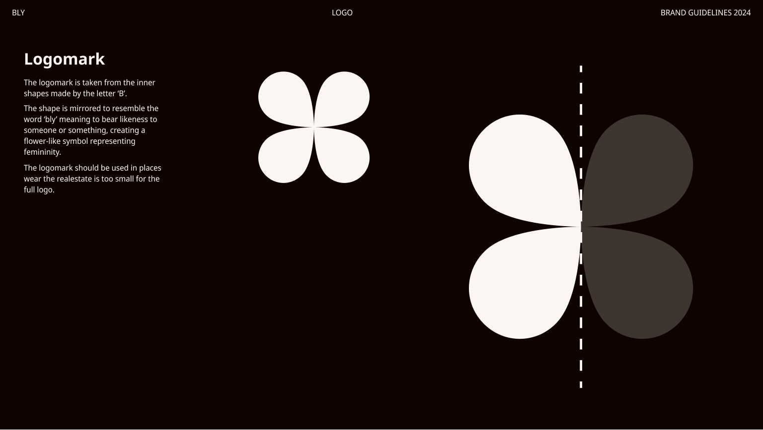
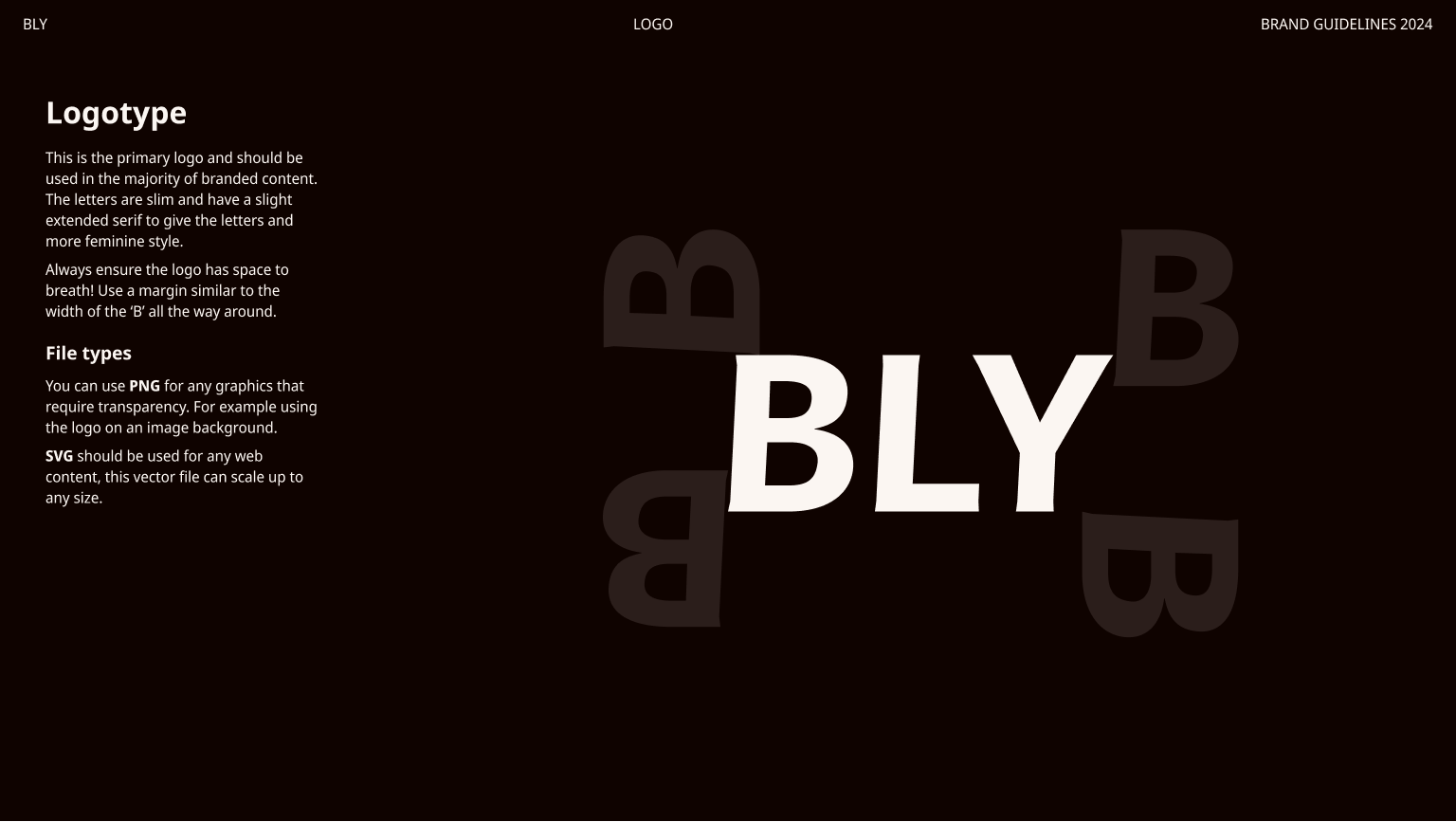
BLY is an old English word used in Devon and Cornwall, meaning to resemble someone or something. This idea became the starting point for the logo. I took the shape inside the B and mirrored it to create the flower-like symbol. The result is a simple mark with a link back to the meaning of the name.
Building the Brand
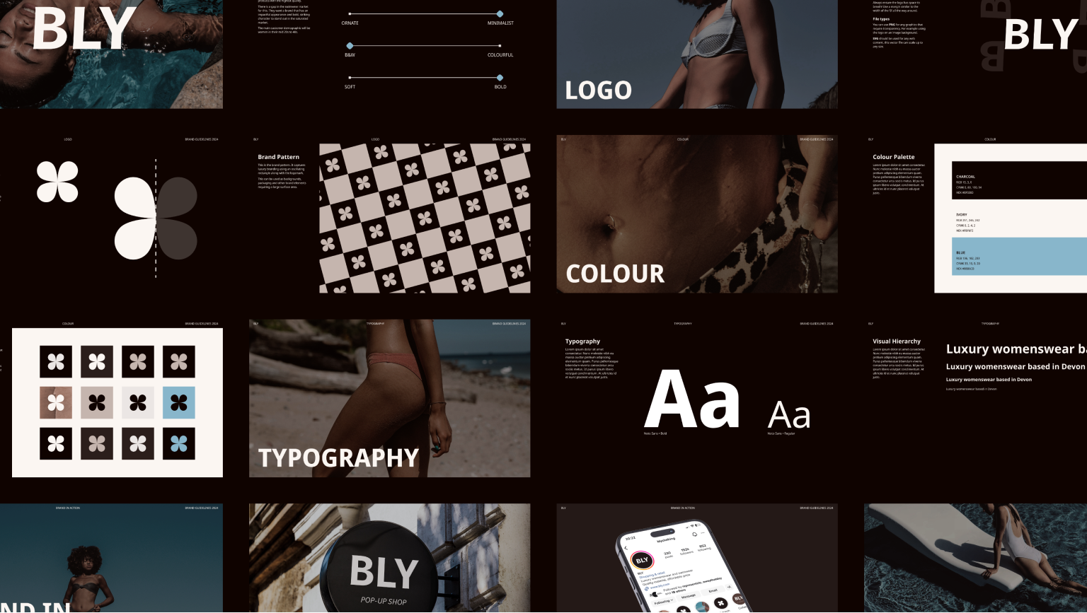
Once the logo was established, I built the rest of the brand around it. The identity uses a bold wordmark, simple typography, a small colour palette and a repeat pattern made from the logo. Each part can be used on its own or together.
Colour
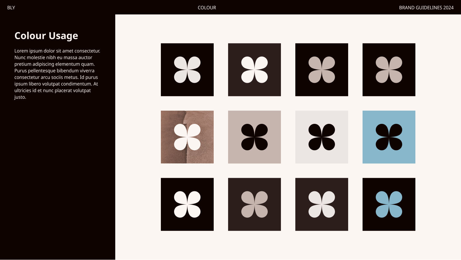
The palette uses charcoal, ivory and blue.
Charcoal gives the brand a strong, premium feel. Ivory adds warmth, while blue brings a brighter touch.
Typography
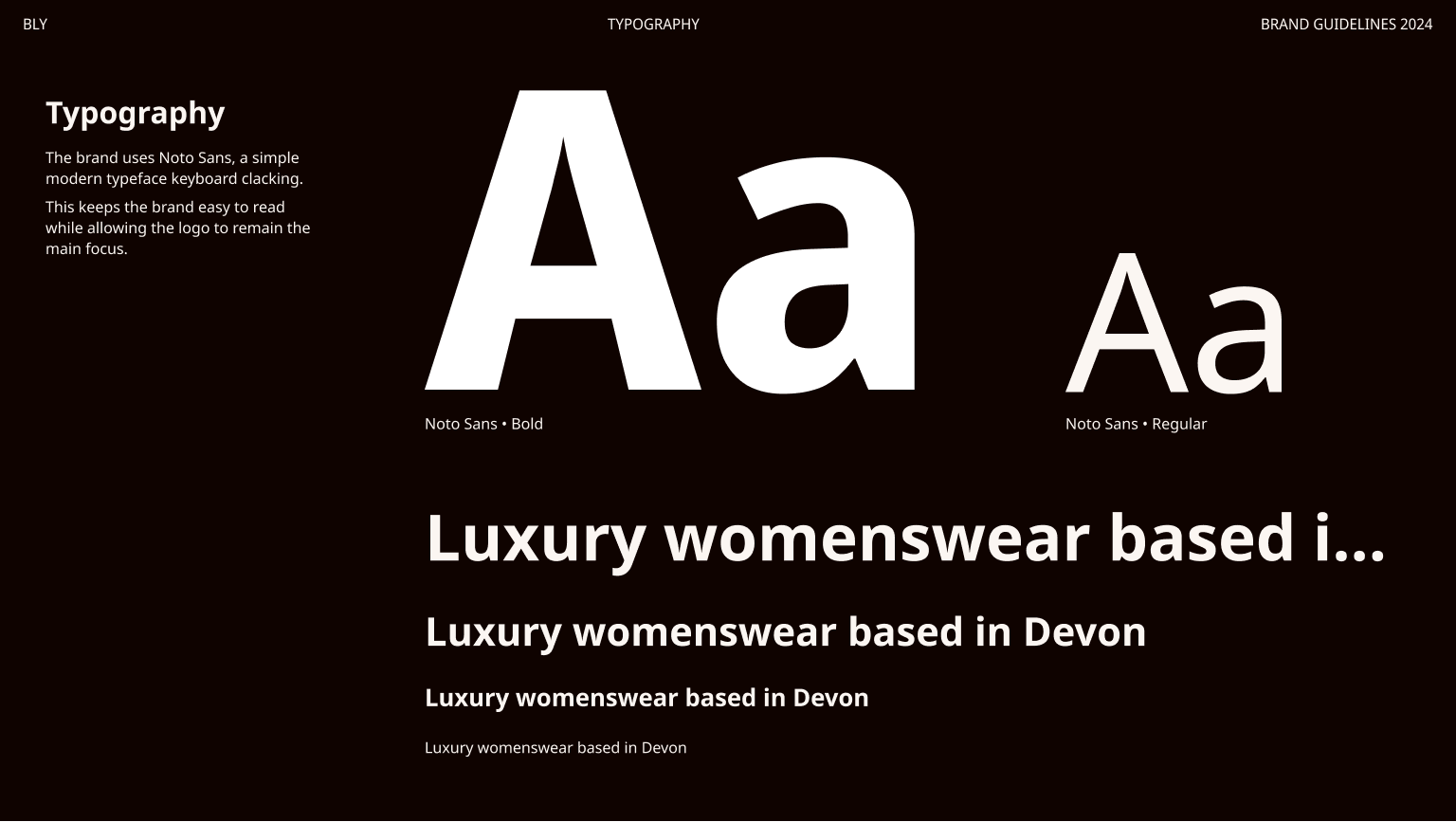
I paired the bold logo with a simple, modern typeface. This keeps the brand easy to read while allowing the logo to remain the main focus.
Brand Pattern
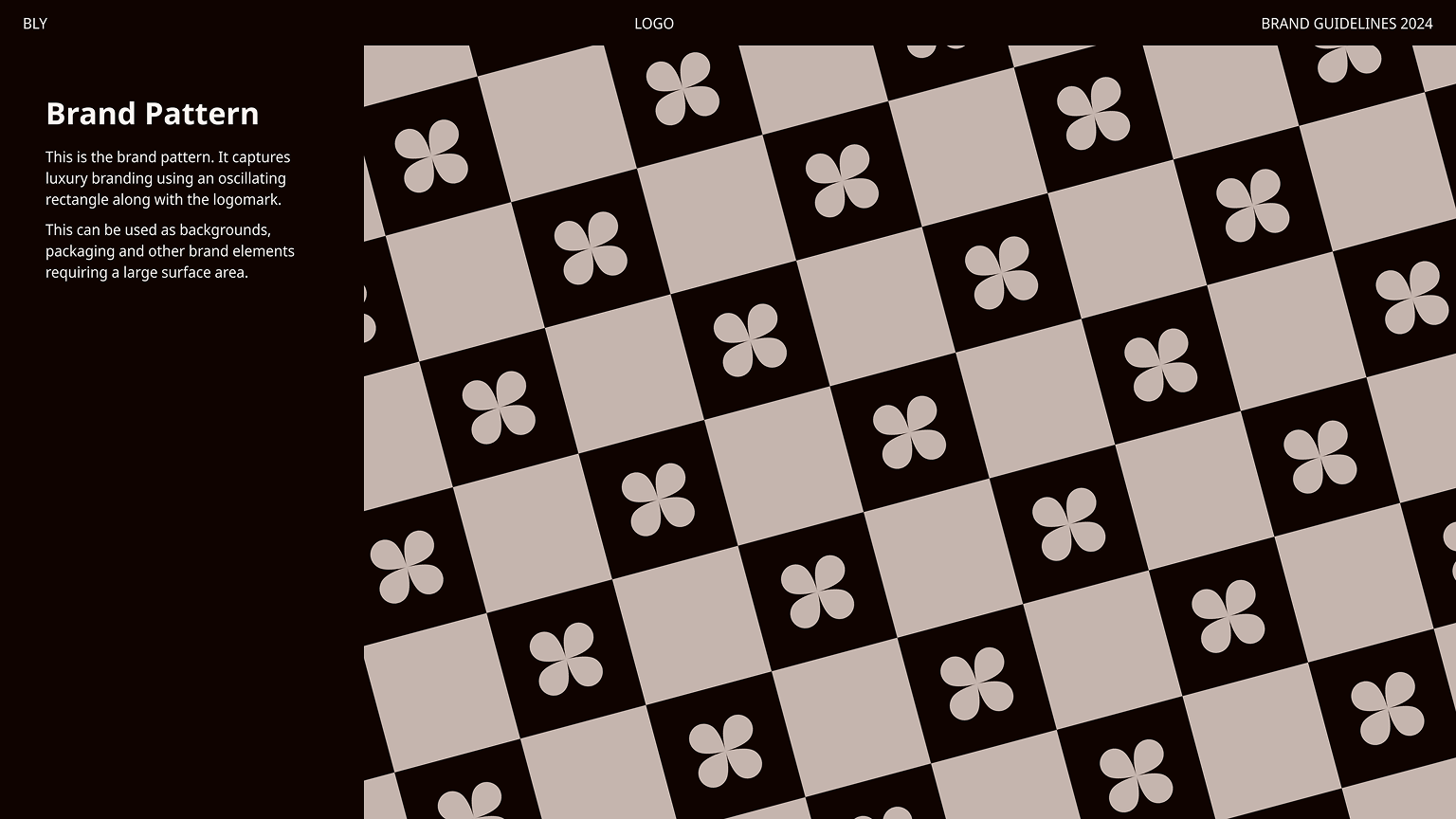
The logo was also turned into a repeat pattern. This gives the brand another way to stand out across packaging, social media and printed materials.
Bringing It To Life
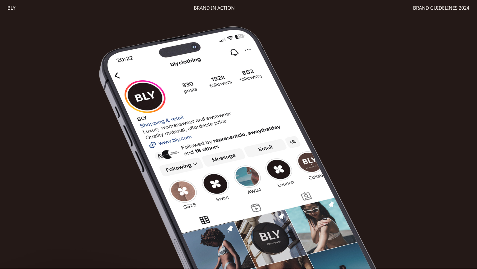
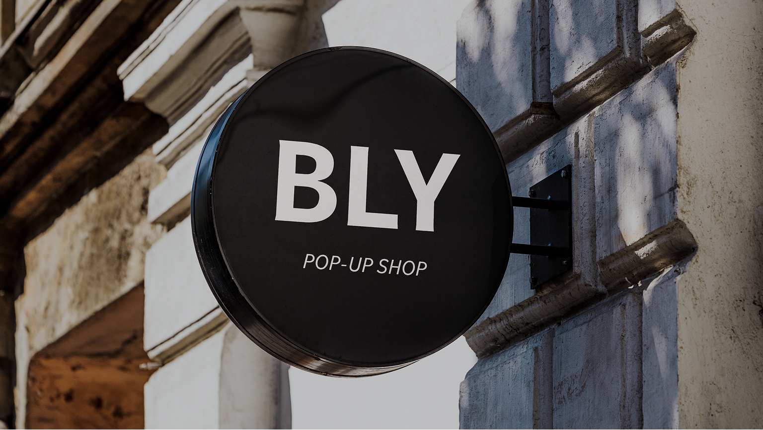
I explored how the brand could work across different parts of the business, including social media, packaging and a future pop-up shopfront.
The aim was to show how the same identity could work across both digital and physical spaces.
The Result
The final identity gives BLY a bold and feminine look that feels premium but approachable.
The brand can now be used consistently across everything from social media to packaging to future retail spaces.