Roasty Coffee
From coffee calculator to brewing companion
Roasty Coffee is a coffee blog with hundreds of articles, guides and recipes. This conceptual project explored how their interactive coffee-to-water ratio calculator could become a more useful experience for people making coffee at home.
 UX/UI Design
UX Design / UX Research & Testing
UX/UI Design
UX Design / UX Research & Testing
The Opportunity
The original calculator provided a simple coffee-to-water ratio, but there was an opportunity to make the experience more useful for people who brew coffee in different ways and have different preferences.
I wanted to explore how a calculator could become part of the coffee-making process, rather than simply providing a number.
Heuristic Evaluation
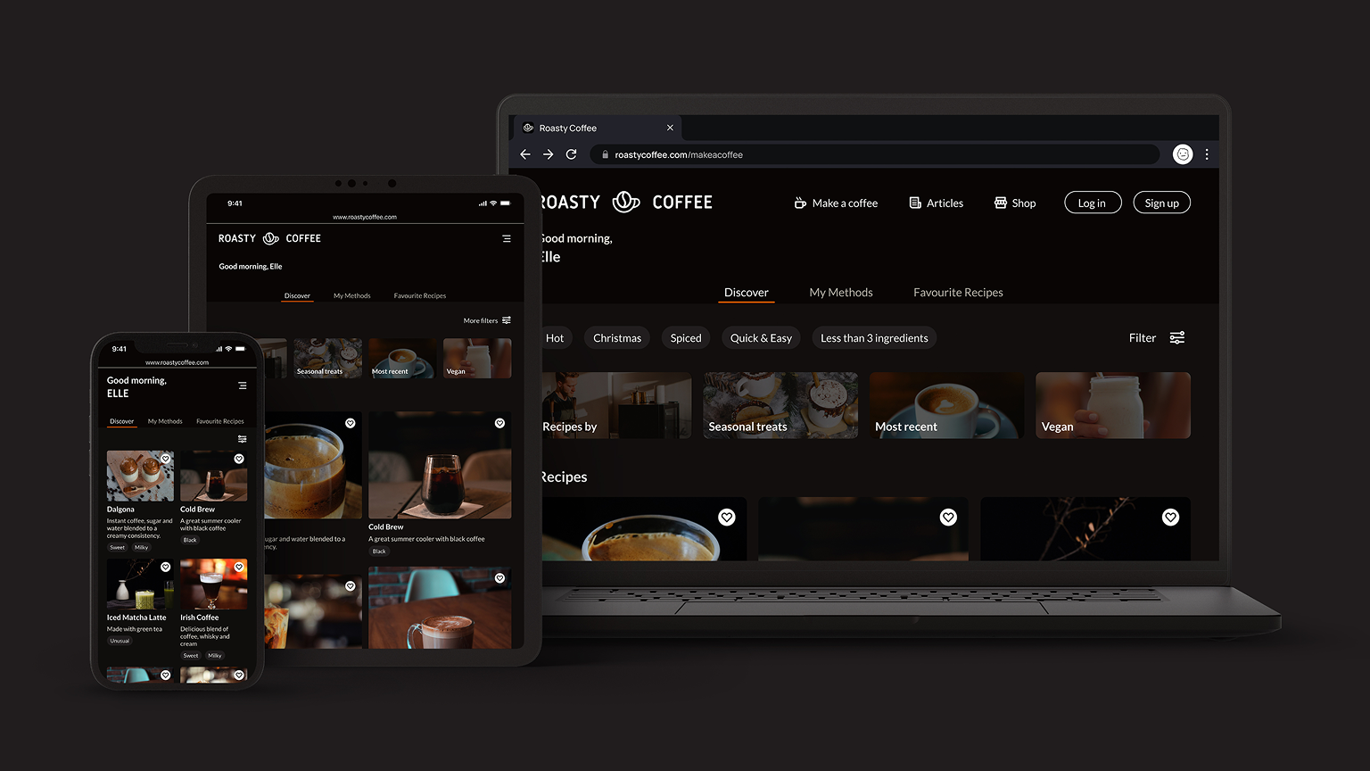
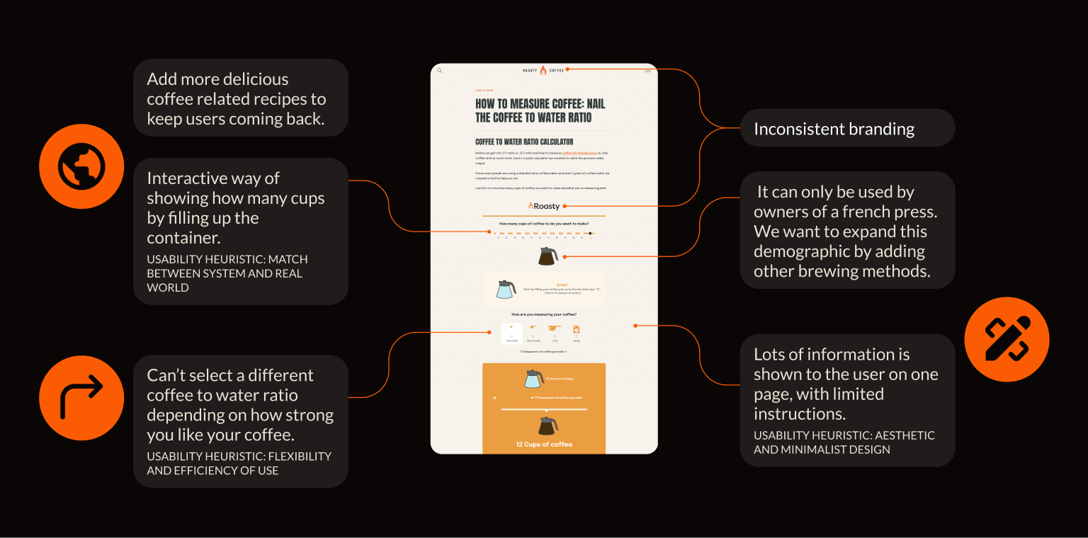
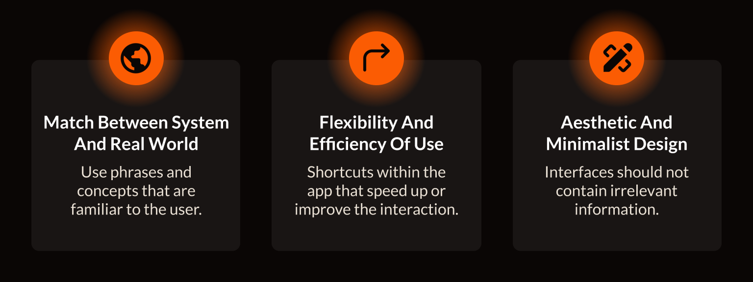
As I didn't have access to Roasty Coffee's analytics or user data, I carried out a heuristic evaluation of the existing experience using Jakob Nielsen's 10 usability heuristics.
I used the evaluation to identify potential usability issues and continued to refer back to the heuristics throughout the design process.
Understanding Coffee Drinkers
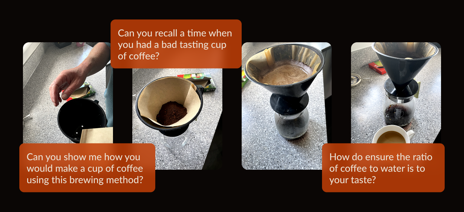
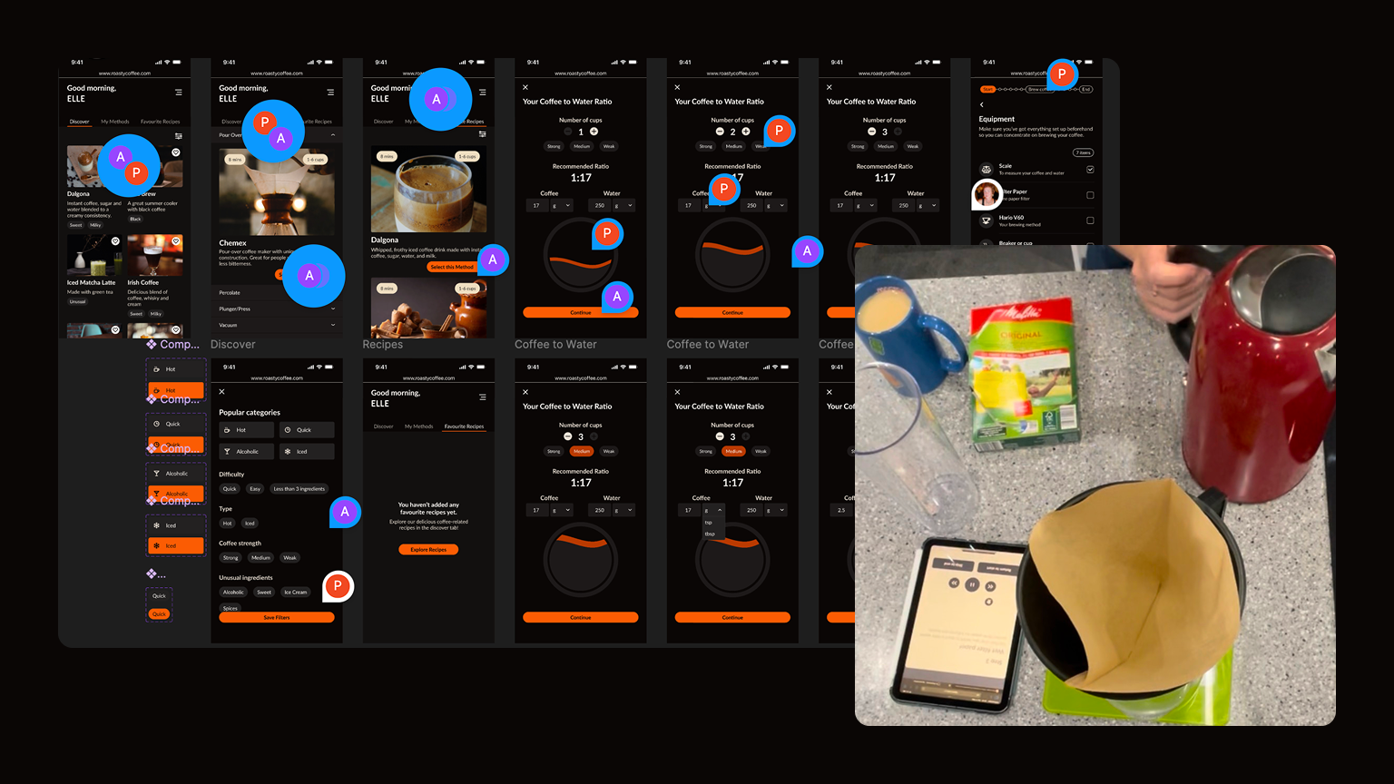
I carried out a contextual inquiry with coffee drinkers to understand what happens when people actually make coffee at home.
Rather than asking people to remember their usual routine, I observed them while they were making coffee. This helped reveal the small decisions, habits and workarounds that can easily be missed when simply asking questions.
What I Learned
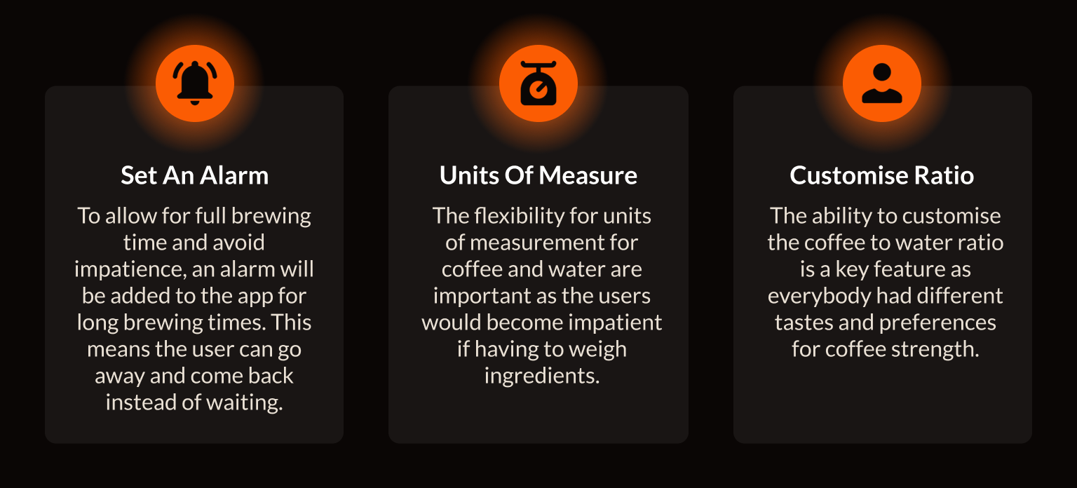
Three themes stood out from the research.
Defining the Experience
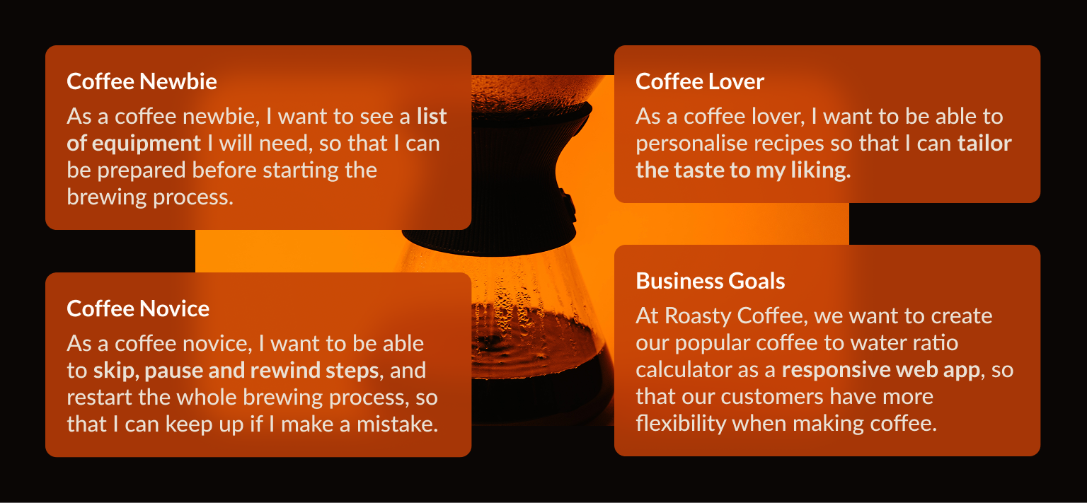
I used these findings to define what the new experience needed to support.
Users should be able to choose their equipment, adjust the recipe to their preference and get guidance while making their coffee.
This led to features including different brewing methods, flexible measurements, strength controls, step-by-step instructions and an integrated timer.
Mapping the Journey
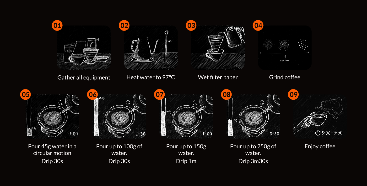
Once the wider experience was defined, I mapped out the journey from choosing a coffee through to finishing the brew.
This helped me understand where the calculator fitted into the process and where the app could provide additional support.
Wireframes and Testing
I started with wireframes to explore the structure and flow before moving into high-fidelity design. The main goal was to make the brewing process simple enough to follow while still giving users control over measurements, brewing method and strength.
I then created a high-fidelity prototype and tested it with three coffee drinkers with different levels of experience. I wanted to understand whether users could follow the brewing instructions, adjust the recipe to their preference, navigate the process without assistance and use the app while actually making coffee.
I also gathered feedback from peers and fellow designers, which helped identify areas to refine before the final design.
Designing from Feedback
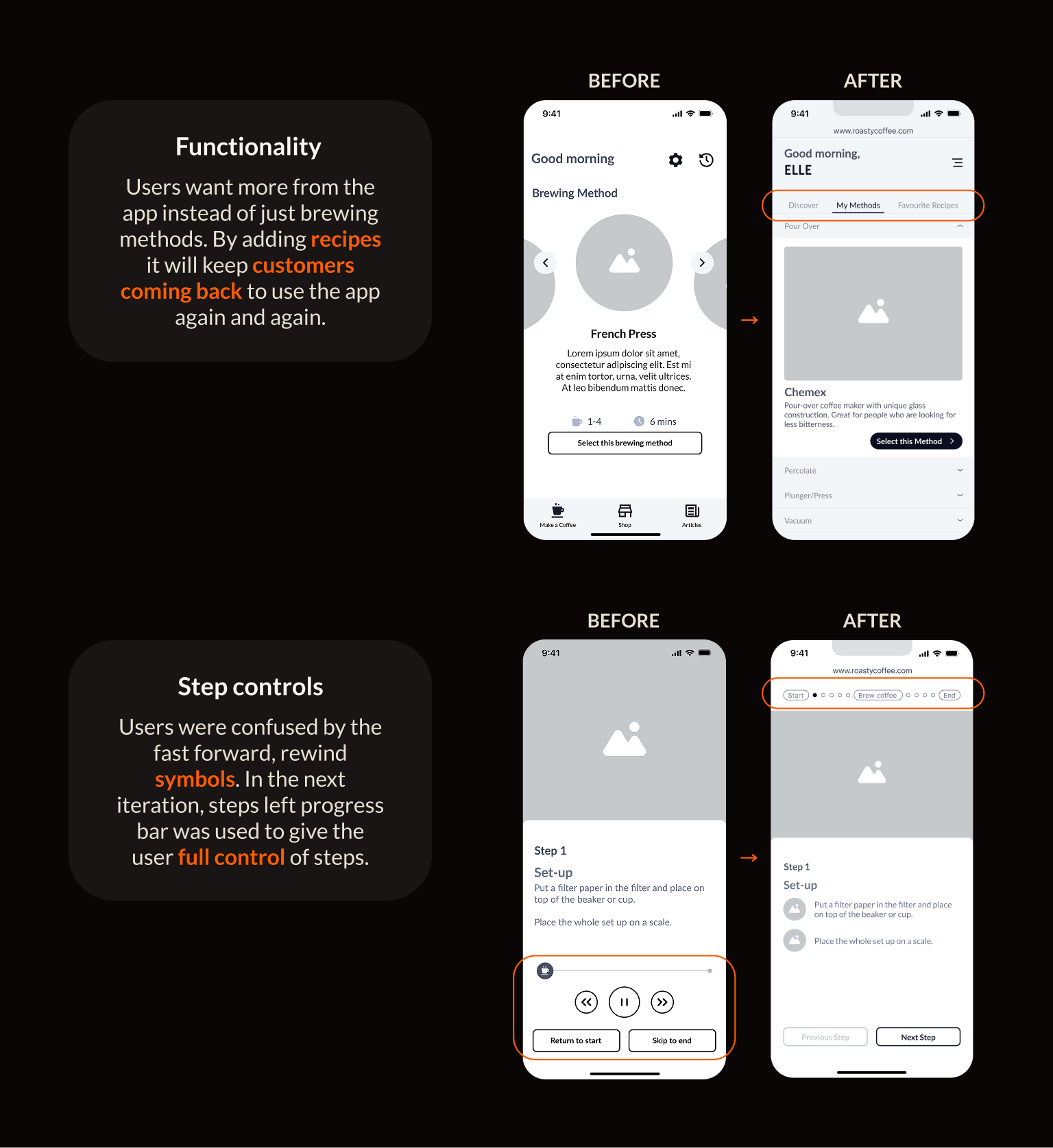
Testing highlighted areas where the experience could be clearer and more useful.
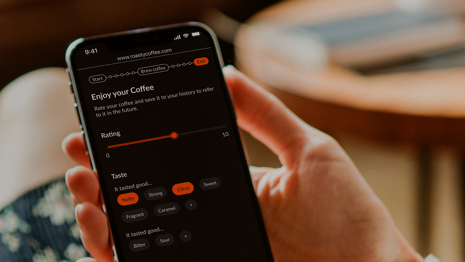
I used the feedback to refine the instructions, interactions and layout, making sure the interface supported the physical process of making coffee rather than getting in the way of it.
Bringing the Brand Into the Product
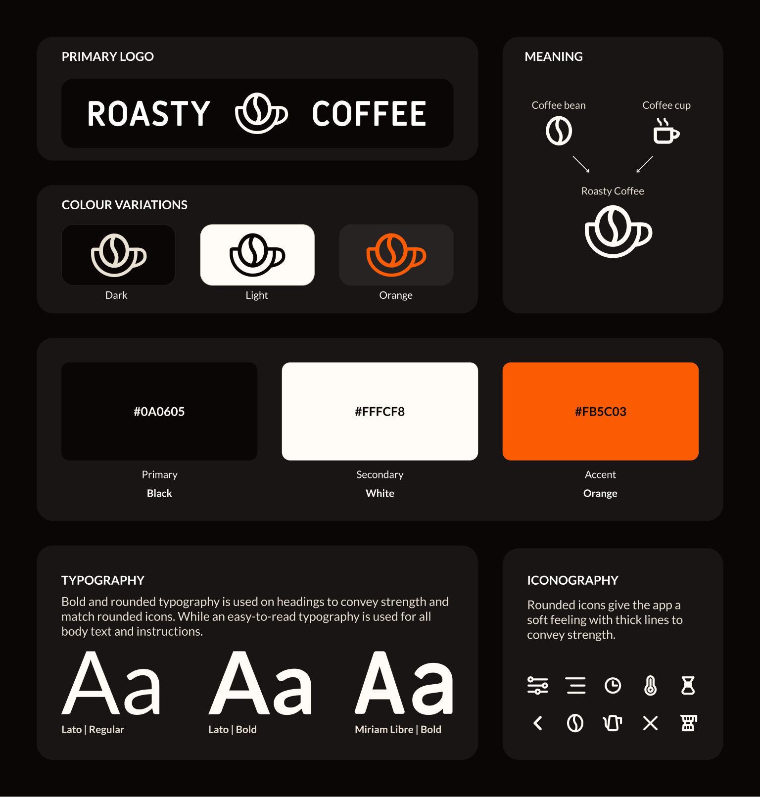
The existing Roasty brand was primarily designed around editorial content, so I adapted it for a more interactive product experience.
I refined the logo and defined the colours, typography and UI elements to create a visual style that felt consistent with Roasty while working across different screen sizes.
Adaptive Design
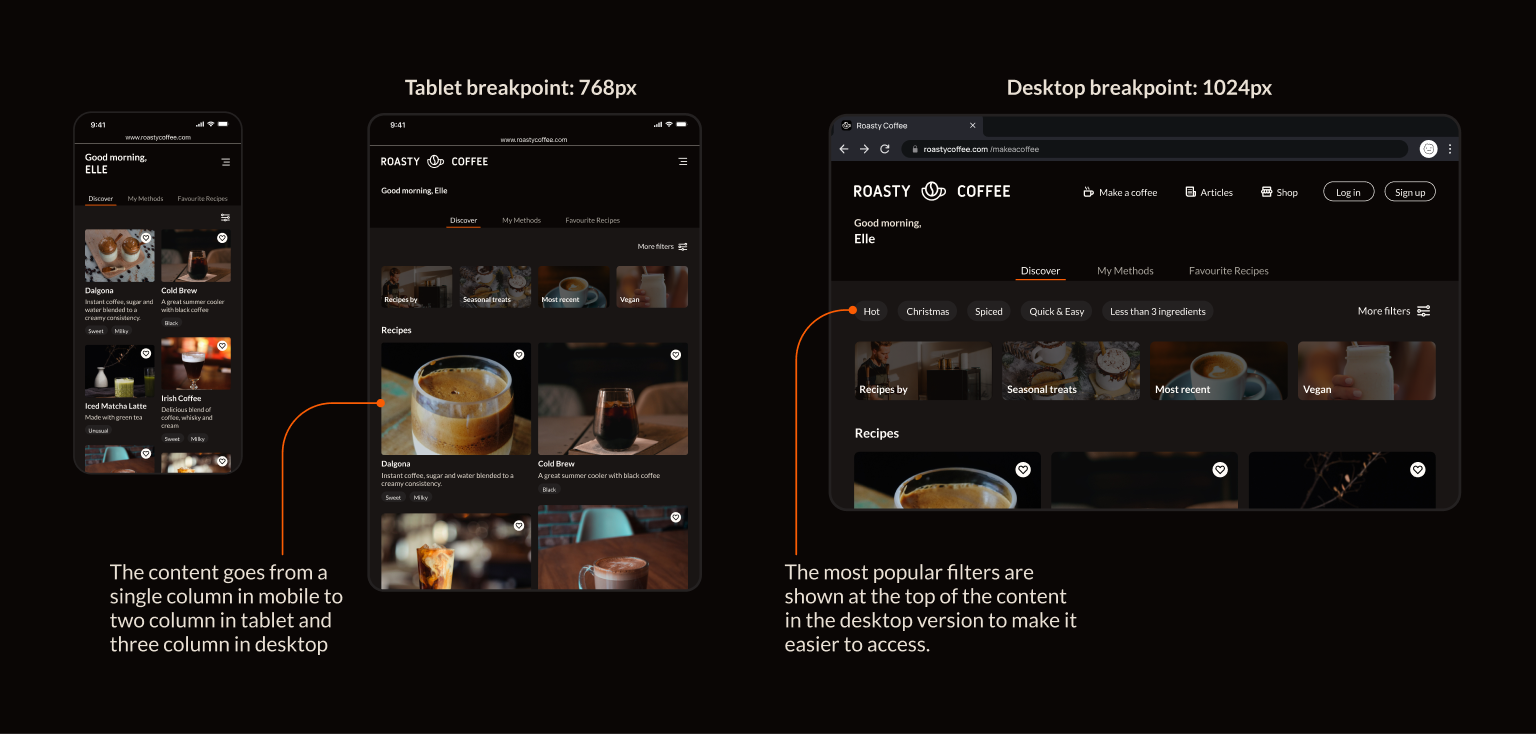
The core experience was designed for mobile, where it would be most useful while brewing.
As the screen gets larger, the layout adapts to make better use of the available space, with additional filters and expanded navigation becoming available.
The Final Experience
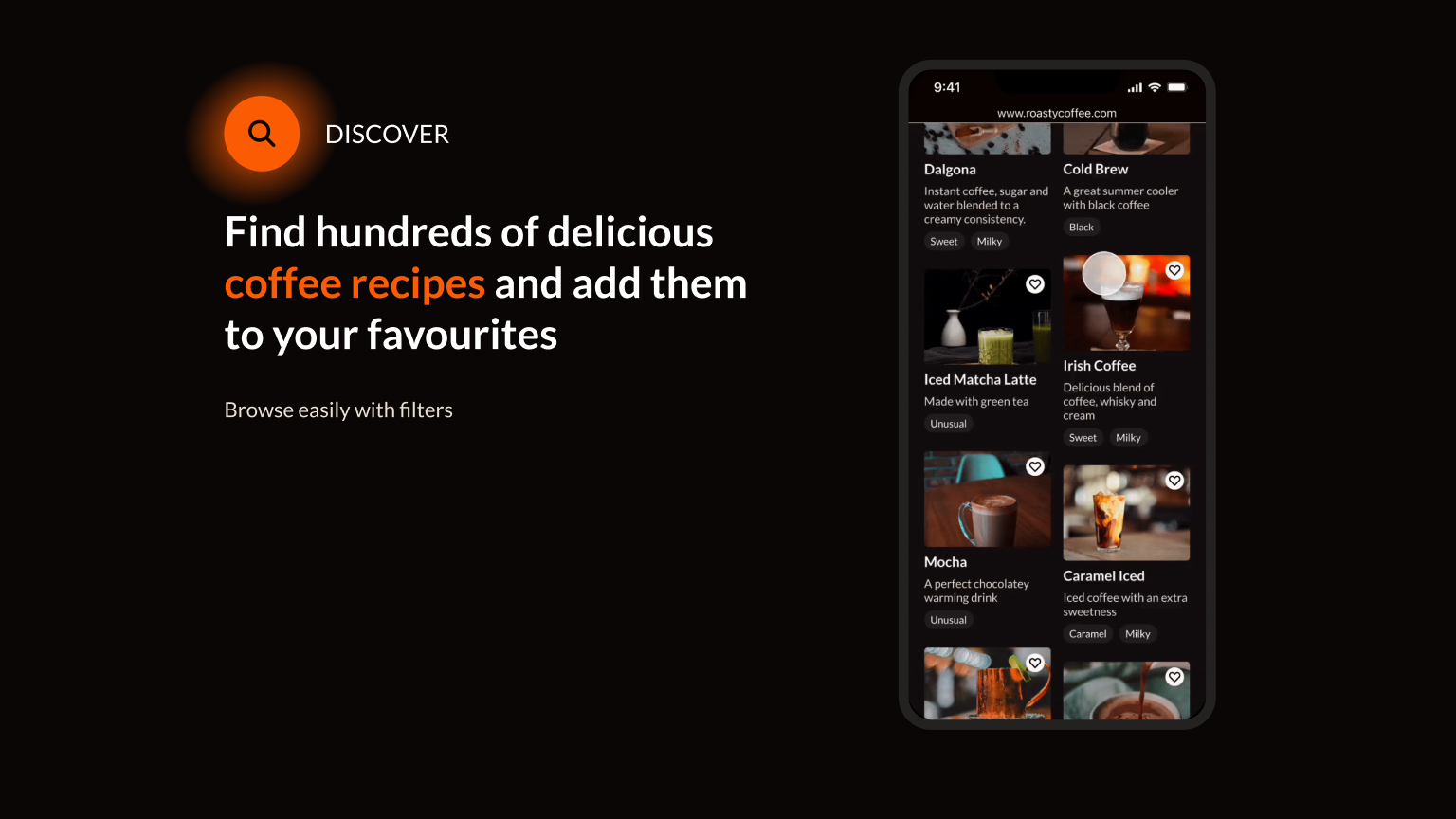
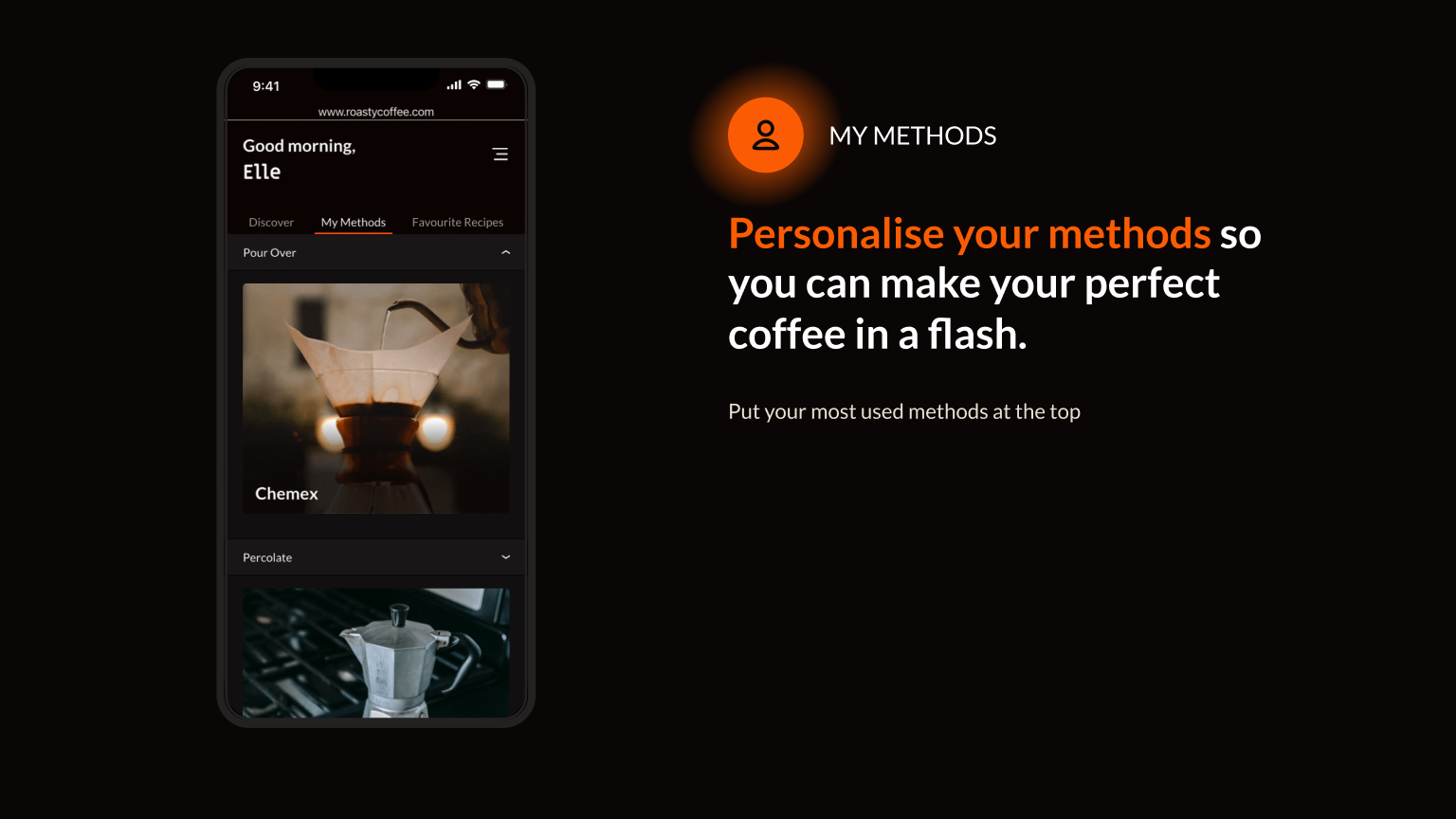
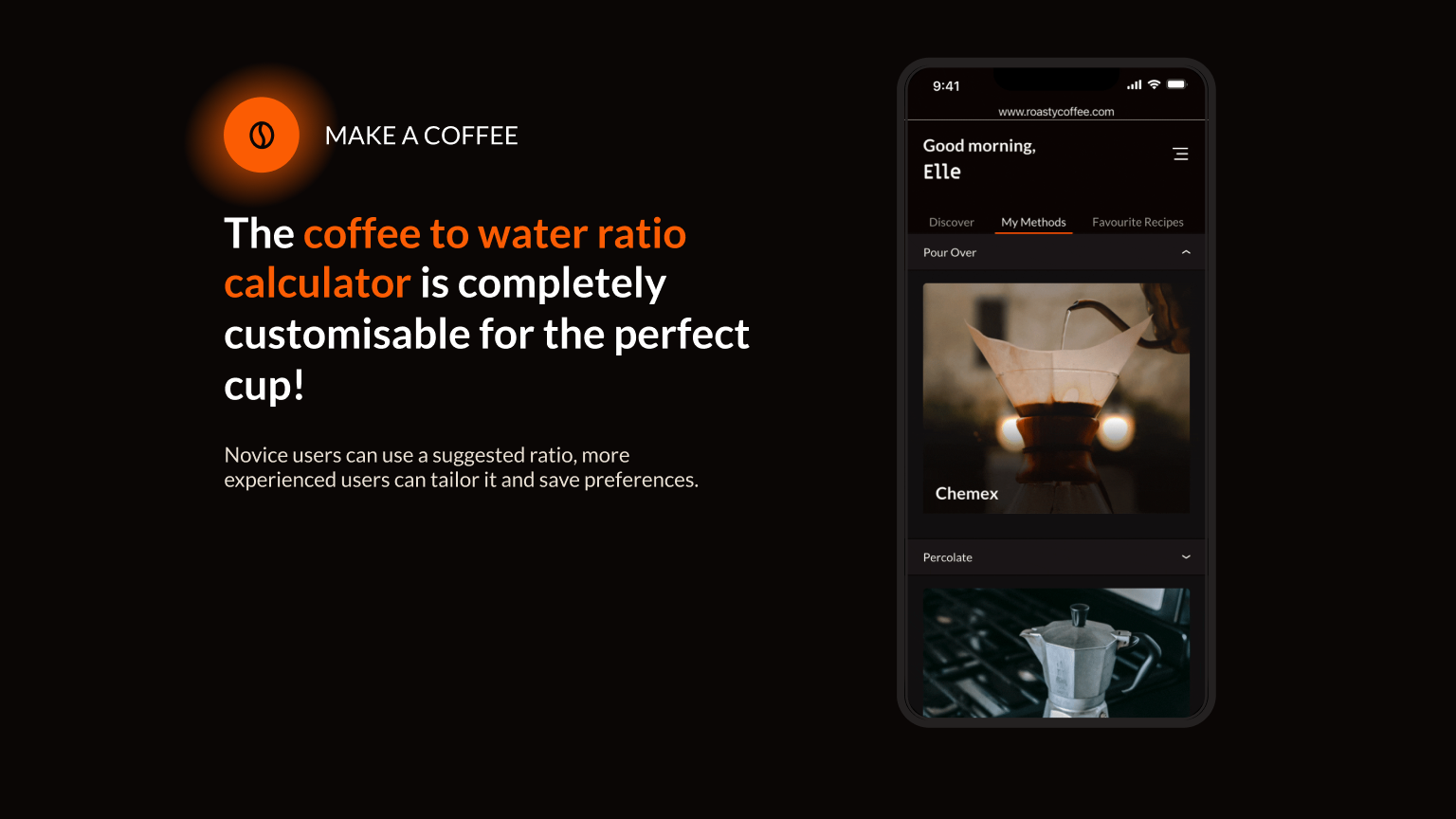
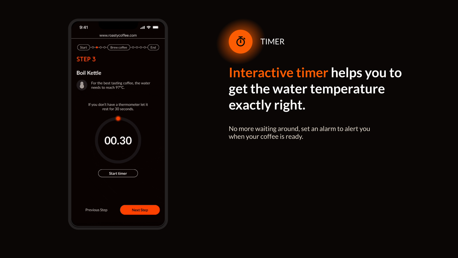
The final design turns Roasty's simple ratio calculator into a complete coffee-making experience.
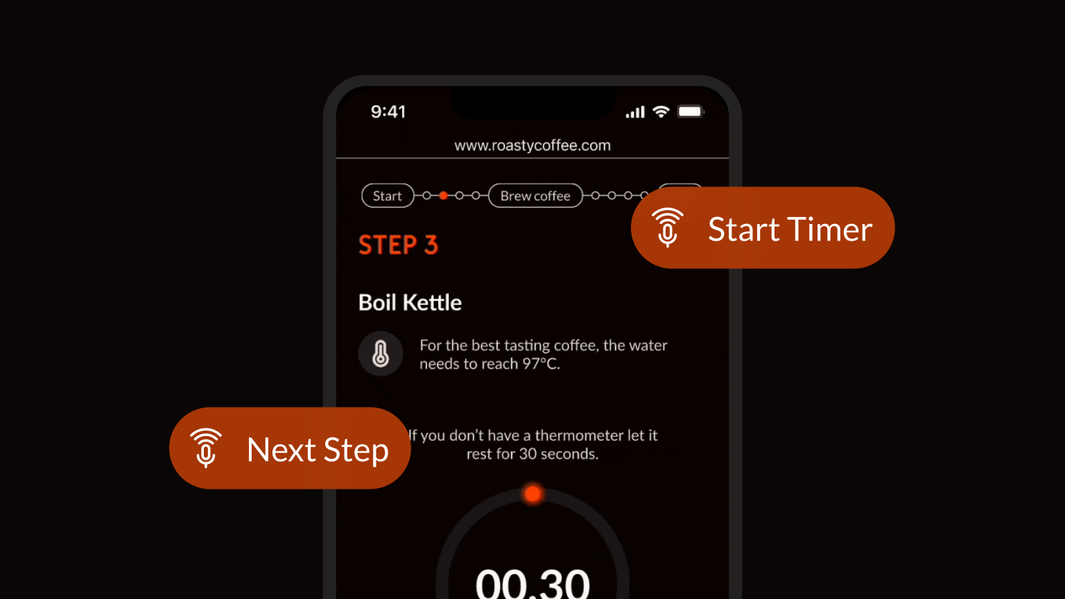
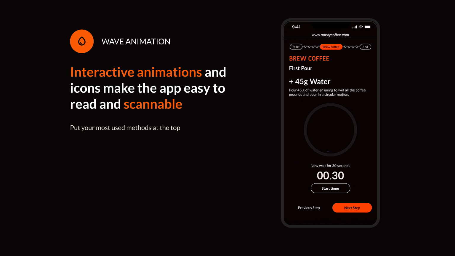
Users can choose their brewing method, adjust measurements and strength, follow step-by-step instructions and keep track of brewing time, all in one place.
What I Learnt
I learnt the importance of designing for the environment in which a product is used. Testing showed that the app needed to fit naturally into the coffee-making routine, so I focused on making it customisable and easy to scan.
I also explored animation as a way to communicate information and create mood.
Responding to Feedback
One participant said they wouldn't use the app. I used this feedback to rethink how the experience could fit into their existing routine, making the interface more flexible and scannable.
What's Next?
I would explore voice commands so users can start timers and follow instructions without touching their phone.
I'd also carry out further accessibility testing and explore improvements across the wider Roasty Coffee app.