Spenny
One app for all your accounts
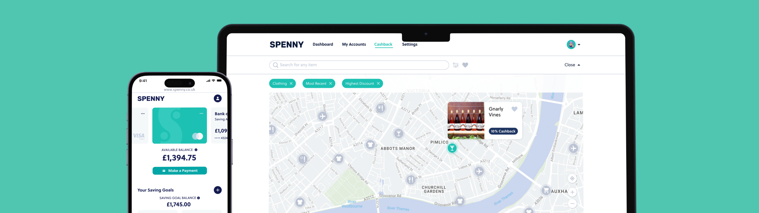
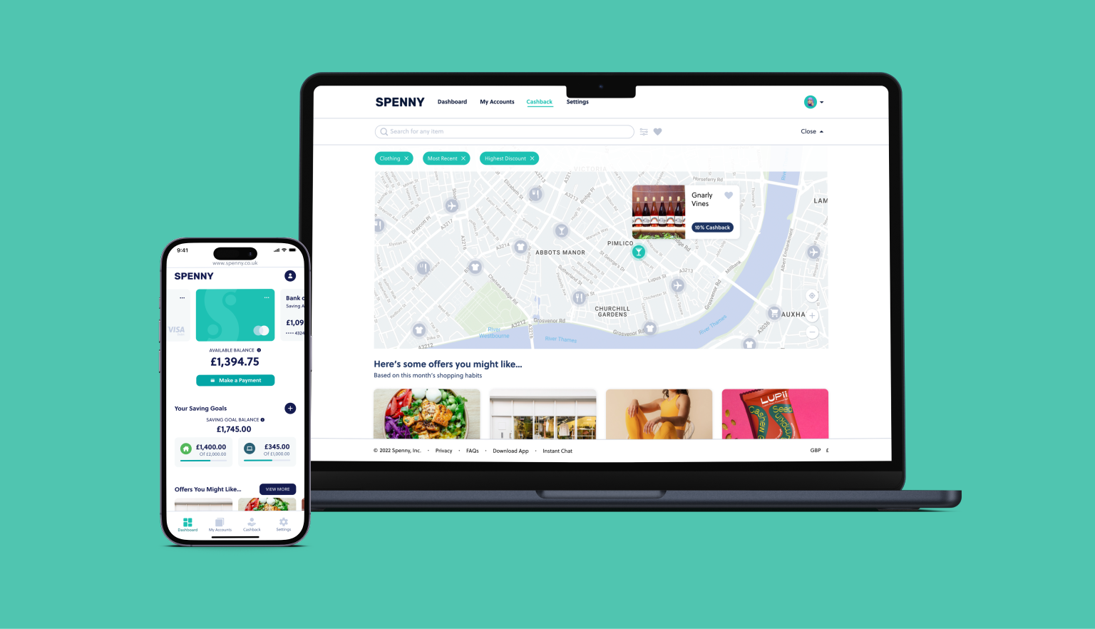
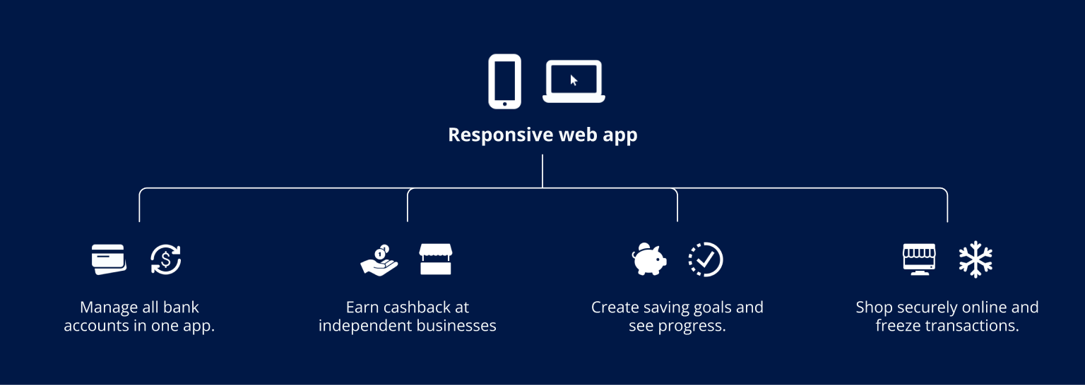
Spenny is a responsive web app for individuals to access all their bank accounts in one place, set saving goals, and earn cashback rewards when they shop at independent businesses.
 UX/UI Design
UX Design / UX Research & Testing
UX/UI Design
UX Design / UX Research & Testing
The Opportunity
Users wanted a single place to see all their bank accounts. Logging into each individual app was time-consuming and confusing. Cashback offers existed but were hard to find and the discounts felt small, so most users didn't bother.
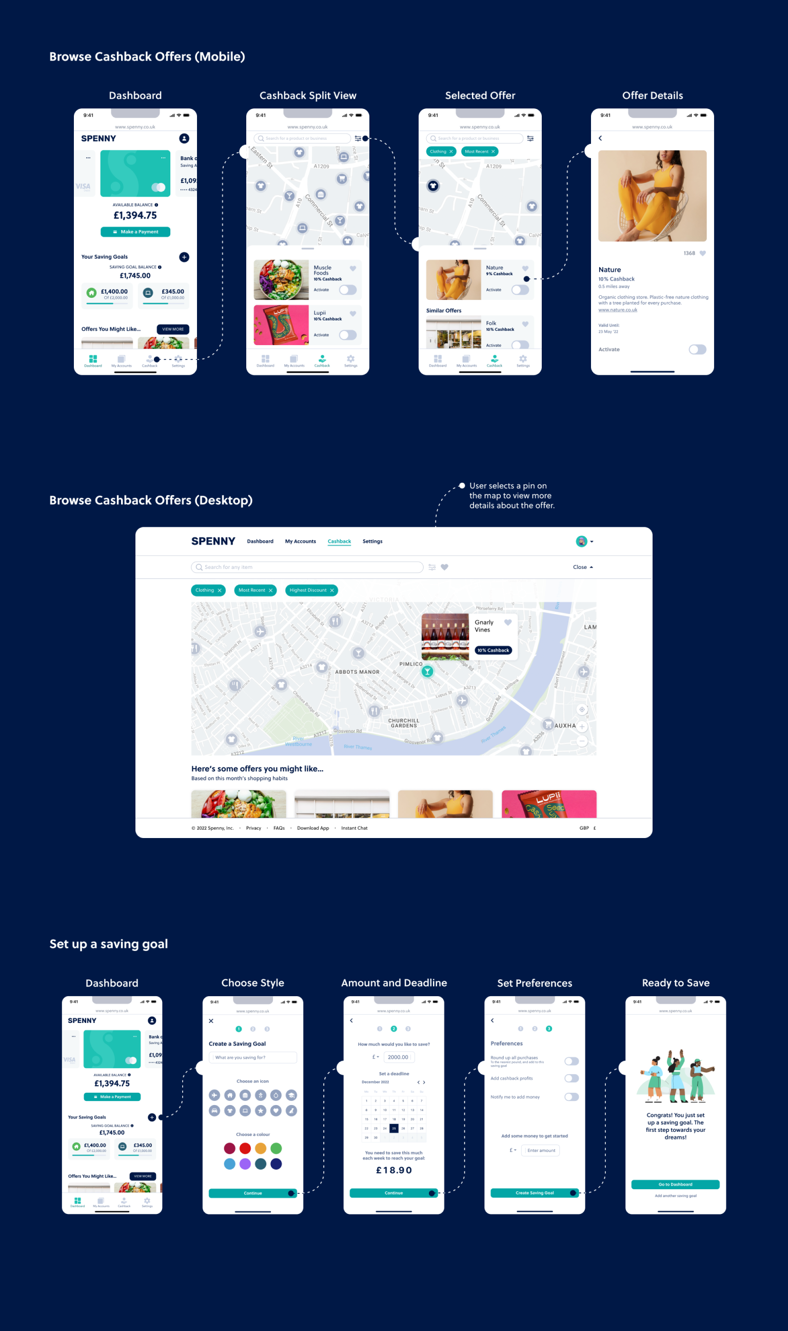
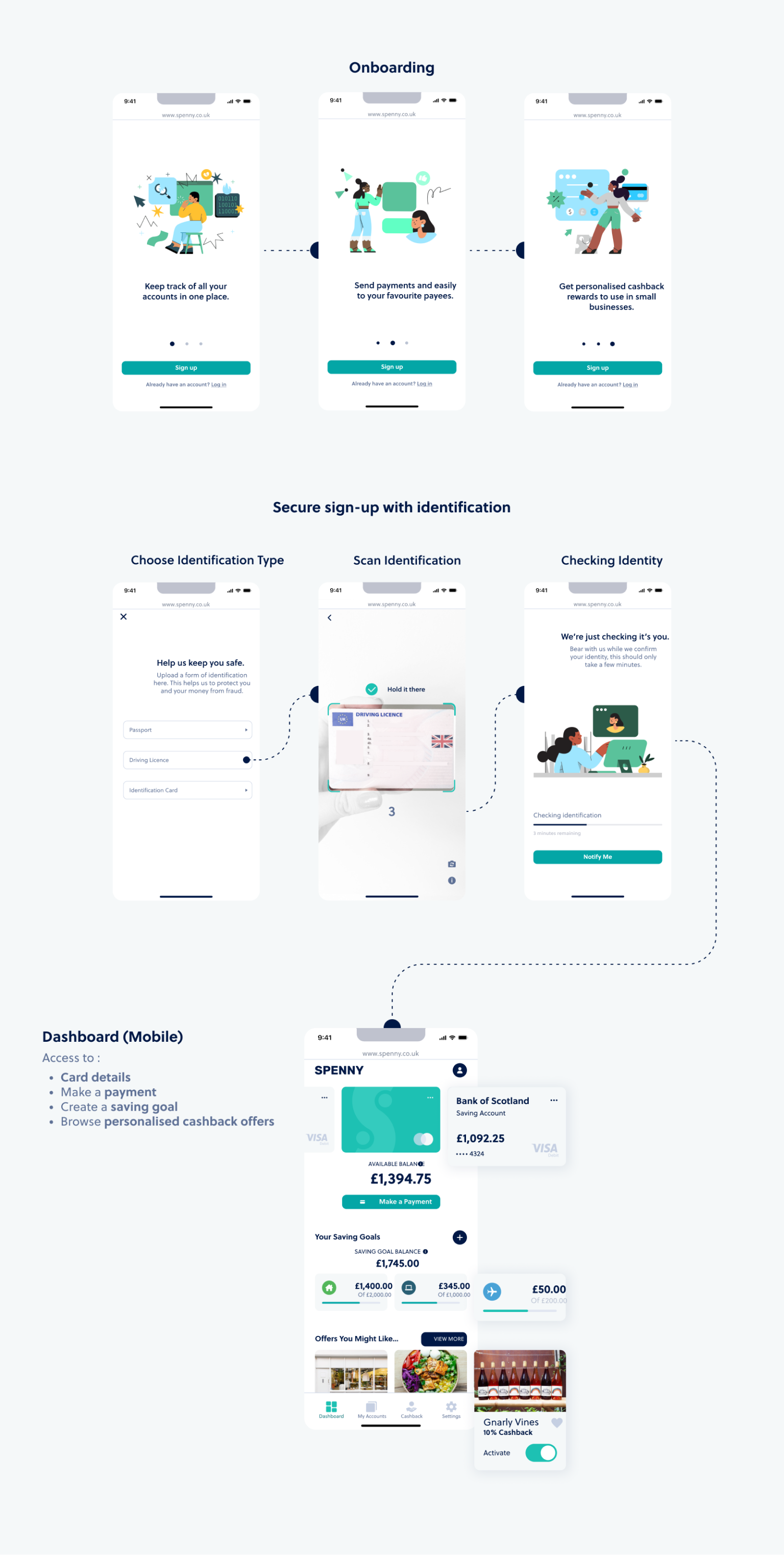
The Spenny app brings all accounts together in one place, with payments, transactions, statements and saving pots built in. A cashback feature lets users filter and activate offers at independent businesses, then pay securely using the Spenny card online and in-store.
Competitive Analysis
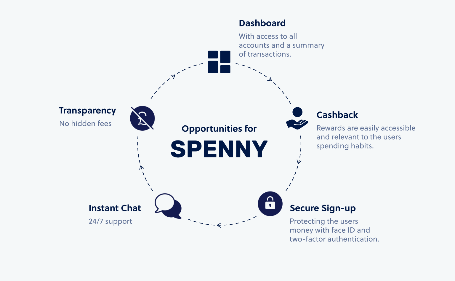
I researched money management apps that also offered cashback, mapping out strengths, weaknesses, opportunities and threats. This helped identify where Spenny could offer something better.
User Interviews
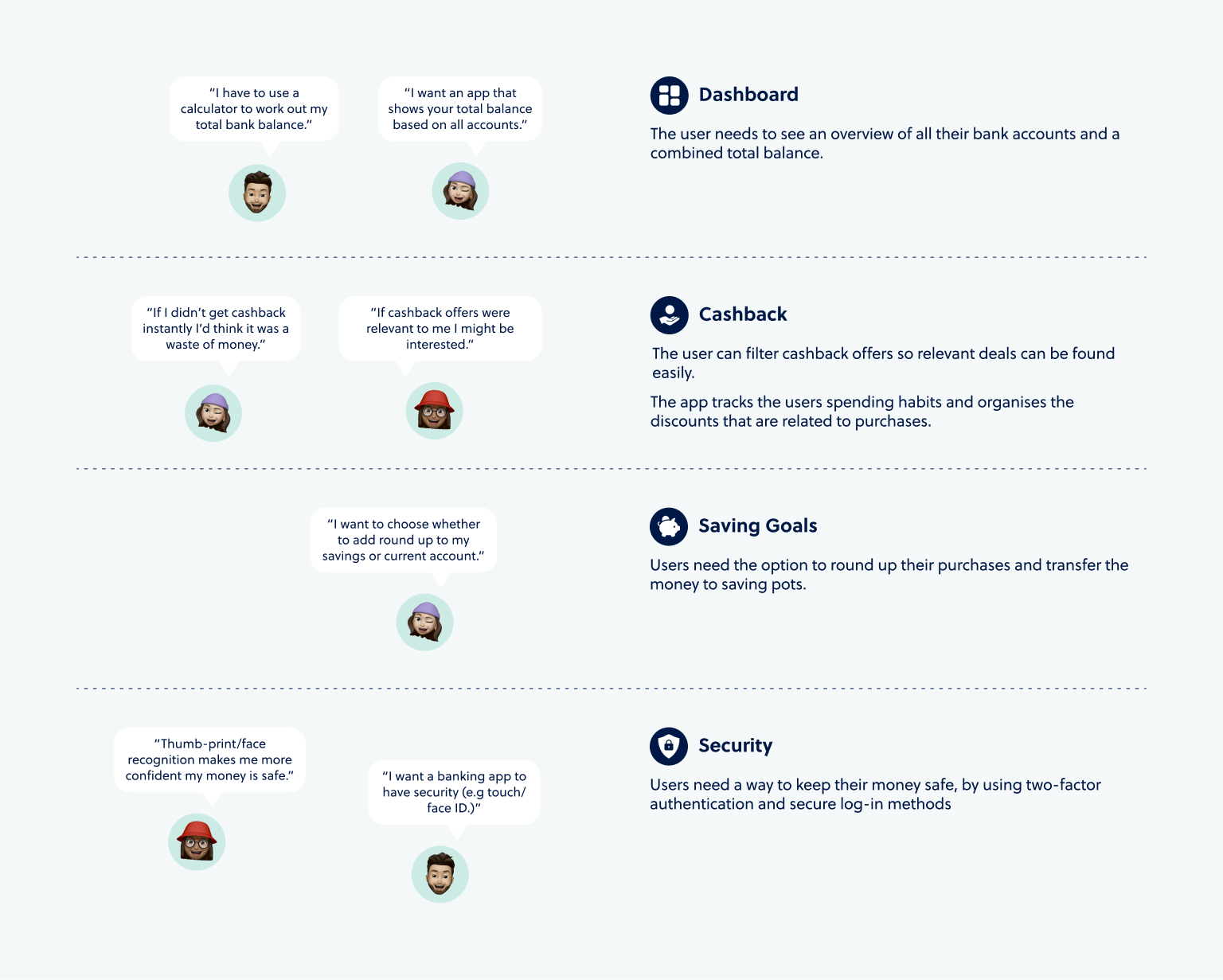
I conducted three in-person interviews to uncover pain points with online banking and hear people's thoughts and reservations about using cashback offers.
Survey Results
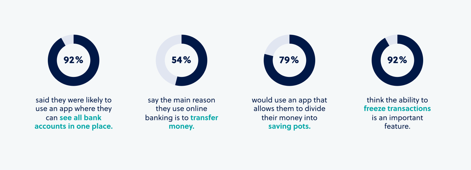
I surveyed 24 participants aged between 21 and 70, asking about their banking habits and how likely they were to use key features of the app.
Feature Prioritisation
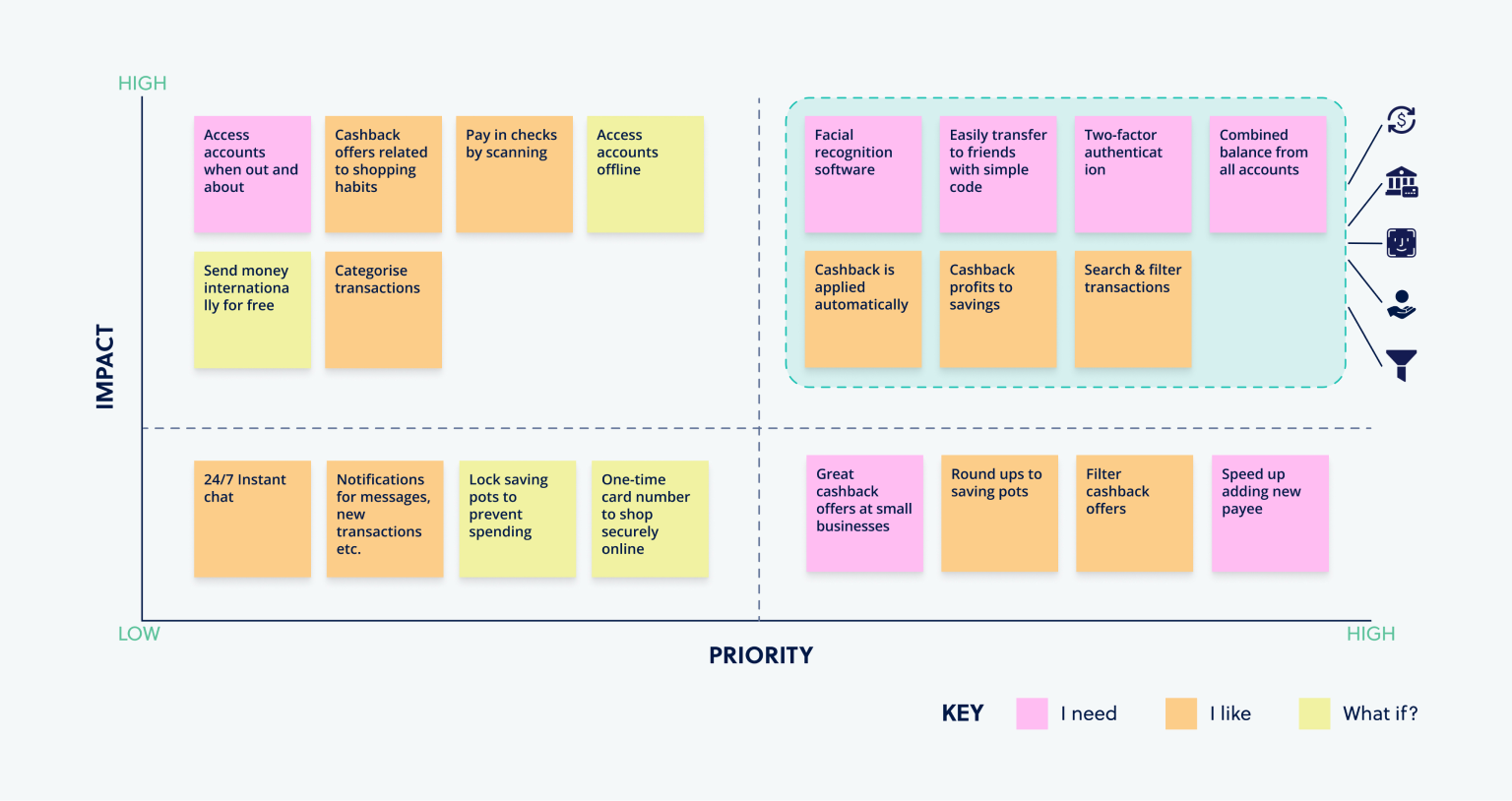
I organised learnings from the research into a feature prioritisation matrix, identifying the features that would have the most impact for users.
User Flow
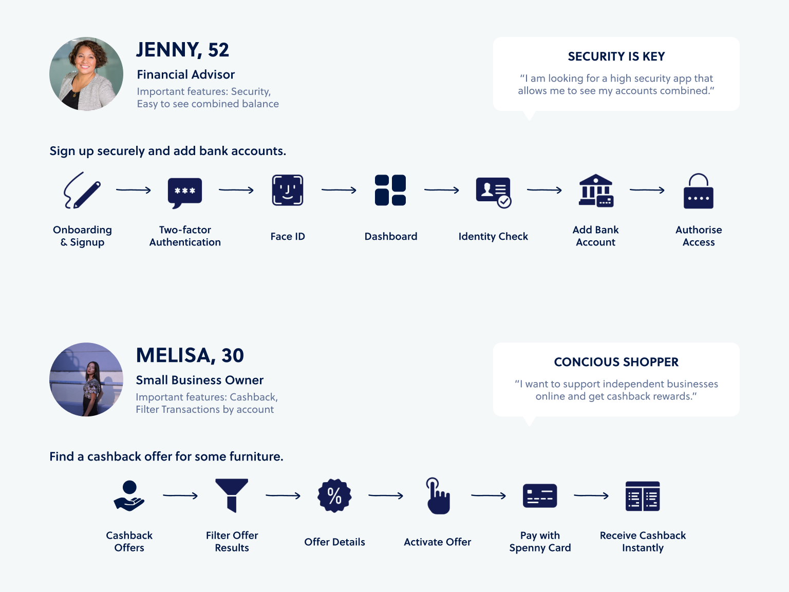
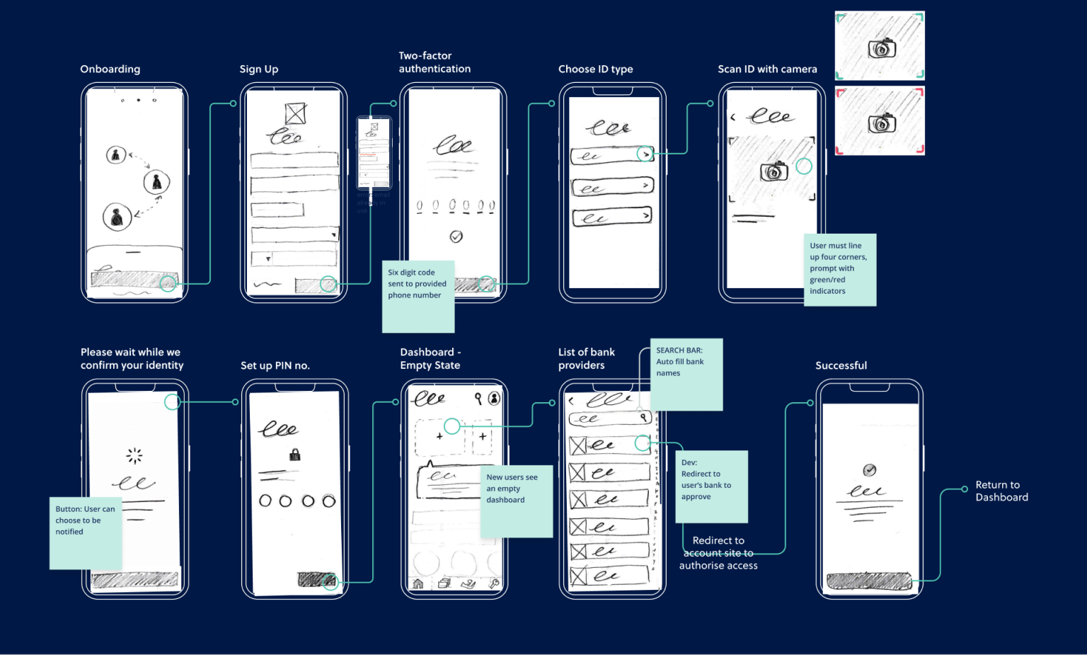
I developed user flows from desired goals and pain points, translating them into step-by-step flows to map out how users would move through the app.
Information Architecture
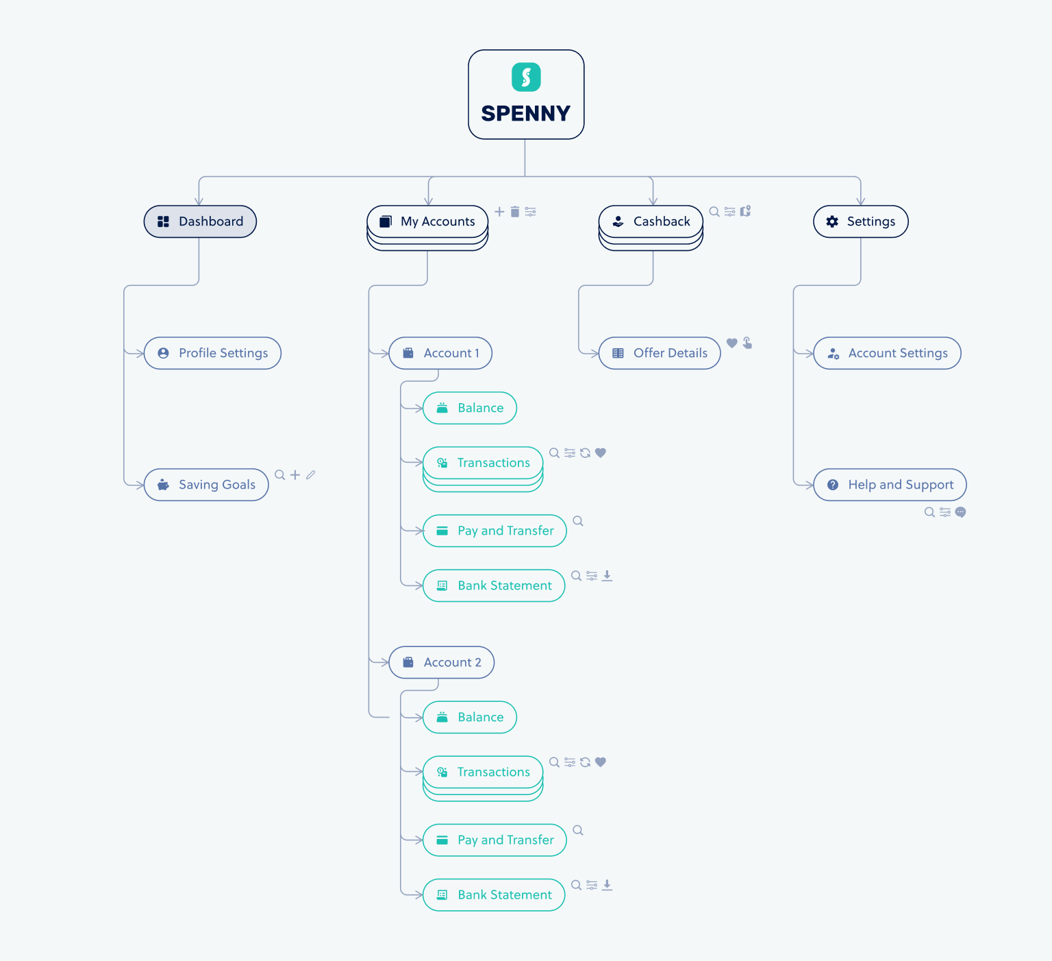
To work out the app's information architecture, I used card sorting. Asking users to group items without any guidance revealed how they expected the navigation to be organised.
Wireframes
I developed low-fidelity wireframes from the features identified through research, exploring layouts and flow before moving into higher fidelity.

User Testing
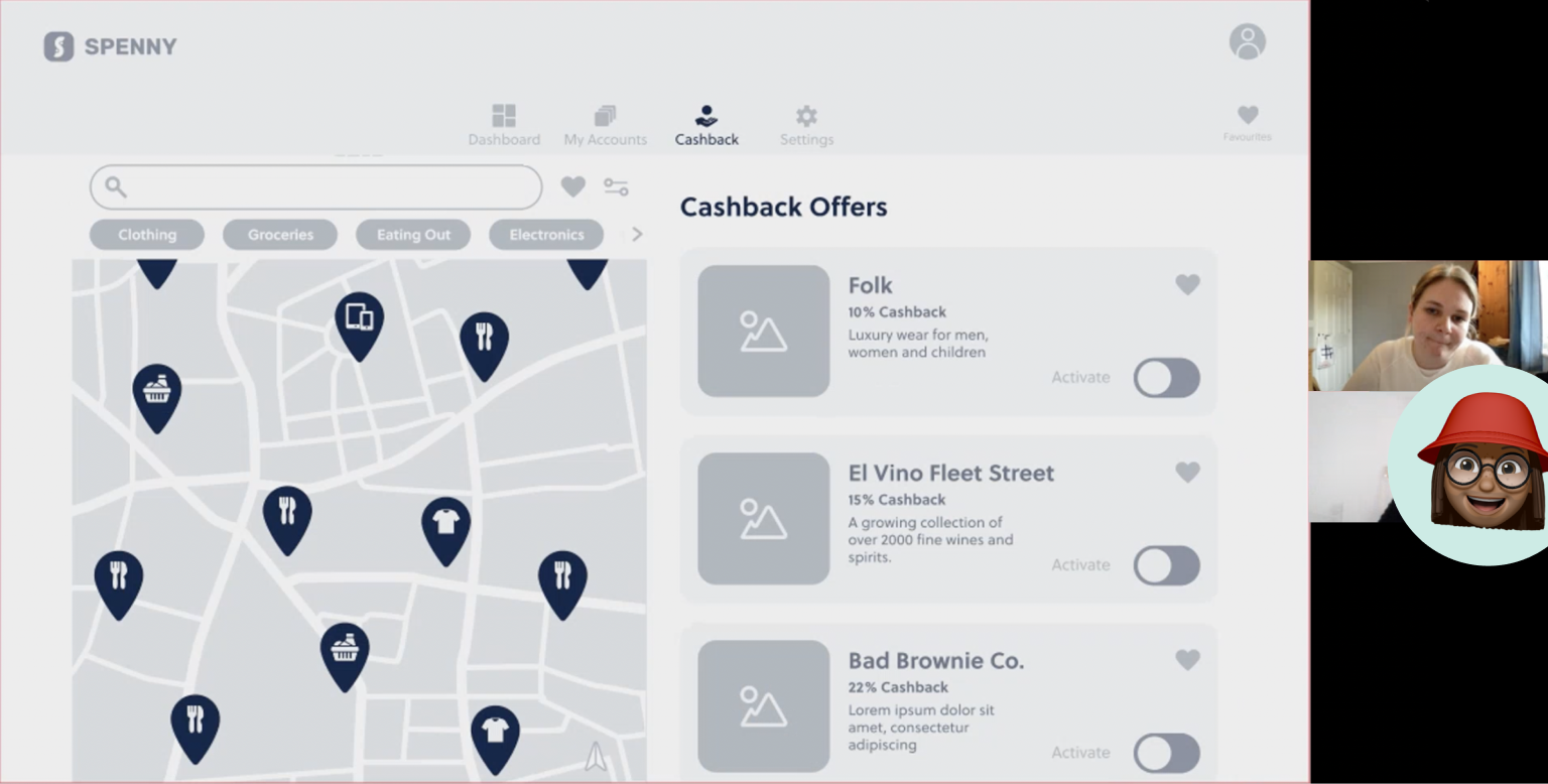
I developed a usability test script and tested the high-fidelity wireframes with five participants. After gathering background information, I described three scenarios and asked participants to complete related tasks.
I then categorised and quantified the results to determine the severity of the issues found.
Findings
Testing revealed two issues to address.
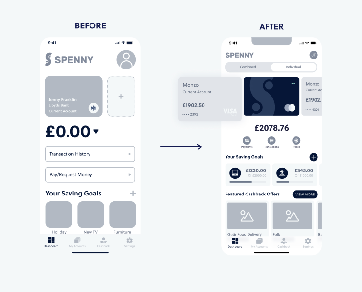
50% of participants were unsure whether the balance shown was for each account individually or a combined total. I added individual card balances alongside a combined total below.
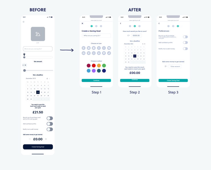
66% of participants tried to drag the progress bar to set a saving goal amount. I split the saving goal setup into multiple steps to reduce cognitive load.
UI and Visual Design
With the wireframes tested and iterated, I developed a brand identity and style guide for Spenny, covering the colour scheme, logo, typography, iconography and design patterns across responsive breakpoints.
What I Learnt
This project helped me refine my skills in writing interview and survey questions, conducting usability testing and analysing the results. I also learnt how to help participants feel at ease during research sessions.
Collaborating with peers gave me valuable insight into which problems needed prioritising. Developing a design style early on kept the work consistent across wireframing and prototyping.

What's Next?
The next steps would be to develop and test more user flows, including making a payment and the in-app chat. I'd also like to explore AI for the chat function and carry out further testing on the desktop version.
Animation is something I want to develop further, and the Spenny app would be a good place to push that.